Over the last few months, Union has been shipping and growing as a project in ways our team couldn’t have envisioned even just six months ago. With our launch of mainnet, expansions into Southeast Asian markets, as well as the announcements of Uname and Auro, we felt it was time for a fresh coat of paint for the Union brand. After a few months in development, we’re excited to share the vision for Union’s future, one that is bright, bold, and rad af.
What’s New?
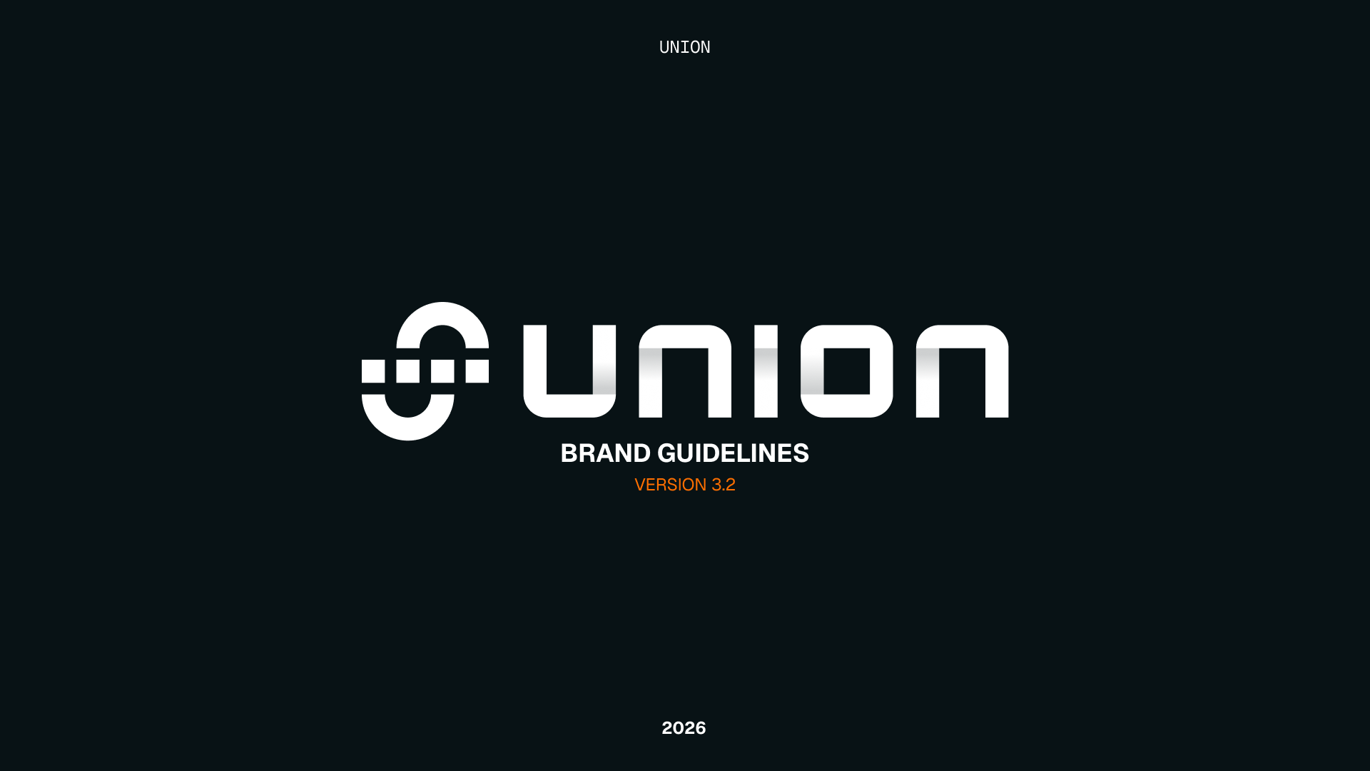
Great question. Well, for starters, we have updated the logotype! The Union logo you know and love will remain largely unchanged aside from a subtle gradient variant to be used in conjunction with the new gradient logotype. This new logotype is actually a retooling of an original idea from our CTO @corcoder that just needed a little more time in the oven and a designer’s eye to make it pop. It utilizes the spaces and shapes within the Union logo to create the typeforms. It’s a little more math rock, and a bit more us.
But a logo on its own does not make a brand. You need systems, colors, images, and vibes to communicate your vision for the project. We have been proud to have one of the most robust brand kits and identities in the industry at our size, and we wanted to turn that commitment to design up to 11. So we wrote an entirely new brand book. Our goal was to develop a new aesthetic that would incorporate the touchpoints and identity we had established, while allowing for mass expansion as we continue to grow.
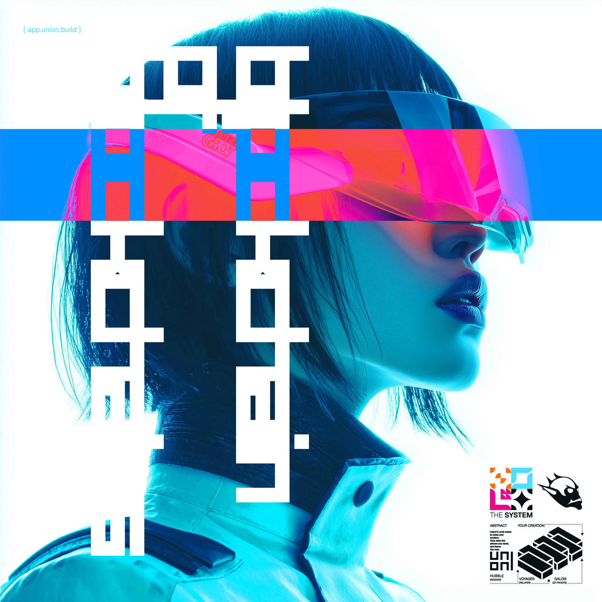
With that brand book, we created a bespoke icon system, a library of micrographics, as well as animations and AI prompting models for creating engaging and eye-catching content that will stand out in the hyper-competitive marketing landscape of crypto in 2025.
So what is that aesthetic?
Wipeout? Like the game for the PlayStation?
Yeah, man.
The new Union identity was inspired by a combination of vectorheart and Y2K aesthetics, primarily following in the footsteps of the work done by Designer’s Republic on the Wipeout game series. We wanted to highlight Union’s speed and our altruistic vision of the ZK future. We added colors, punched up the Union blue, and created a design language that should always feel fresh and distinct on the timeline. Other inspirations include Formula 1, Make Haste Corp, Nike, Teenage Engineering, Mirror’s Edge, and other artists.
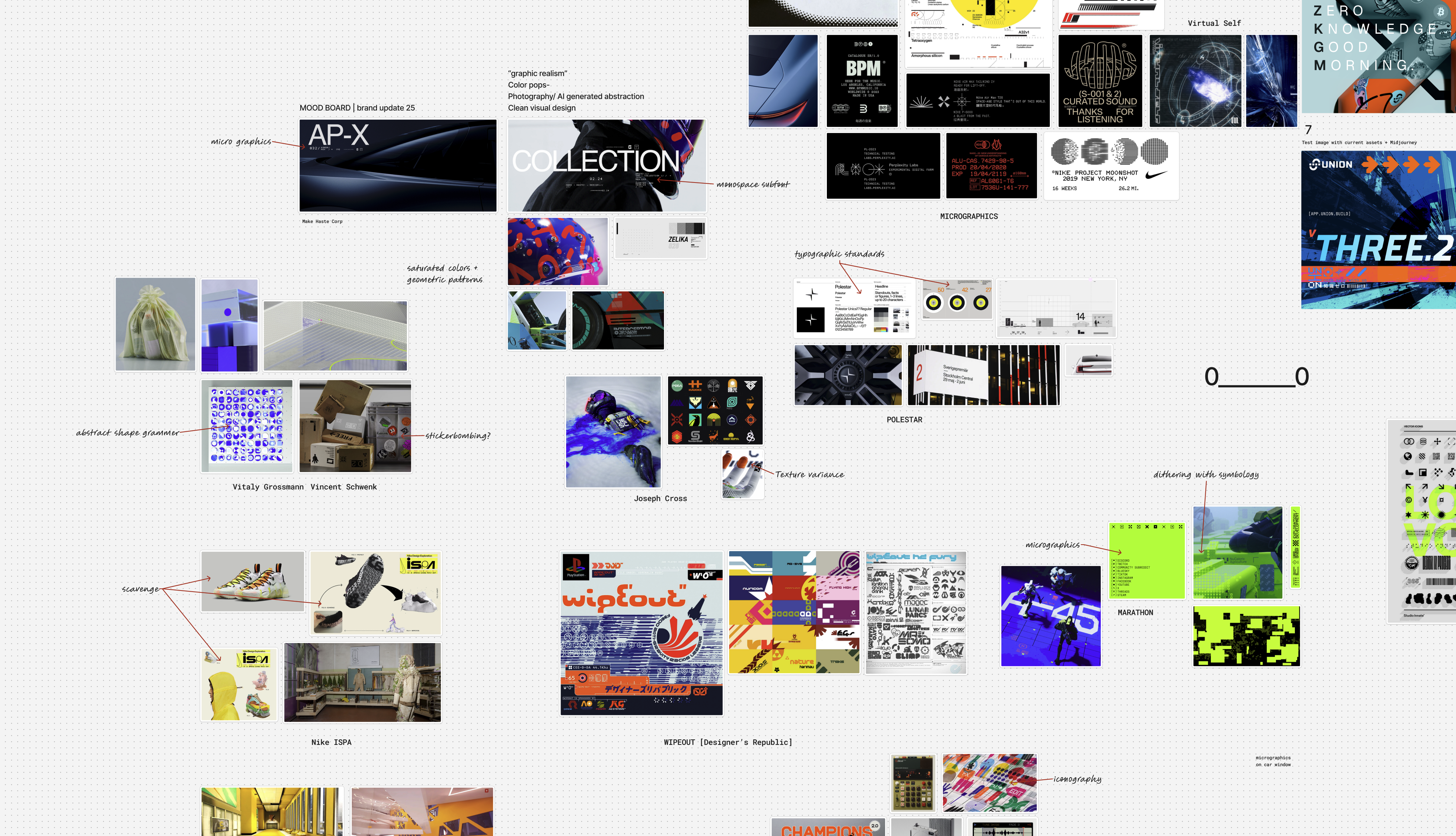
Alongside these inspirations, we have also made an effort to add more global elements and visuals to our brand. Union was built by a global team for a global userbase, so our brand now reflects our intentions to be the global leader in ZK L1s.
Easter Eggs & Asset Library
The new visual aesthetic is packed full of references to Union, our community, our tech, and the foundations of our team. Real Union Maxis will get a lot of the references in our micrographic language, but some are very deep cuts, even for team members themselves. The entire library of micrographics and icons will be made available in the brand kit for community use, offering an unprecedented level of access to brand touchpoints for users to create content with.
What’s Next?
The brand is just a single point in the chain that is Union. While the design team has been working on this, work has not stopped on building the future of ZK L1s. Expect some visual transitions over the coming months as our website and applications are updated visually to better align with the new guidelines. These changes will not affect the core user experience of any of our products, as UX remains a top priority for the team.
Thanks for the support we have received during the transition from our partners and teams building alongside us. Let’s keep building and growing together.
ZKGM 0_______0